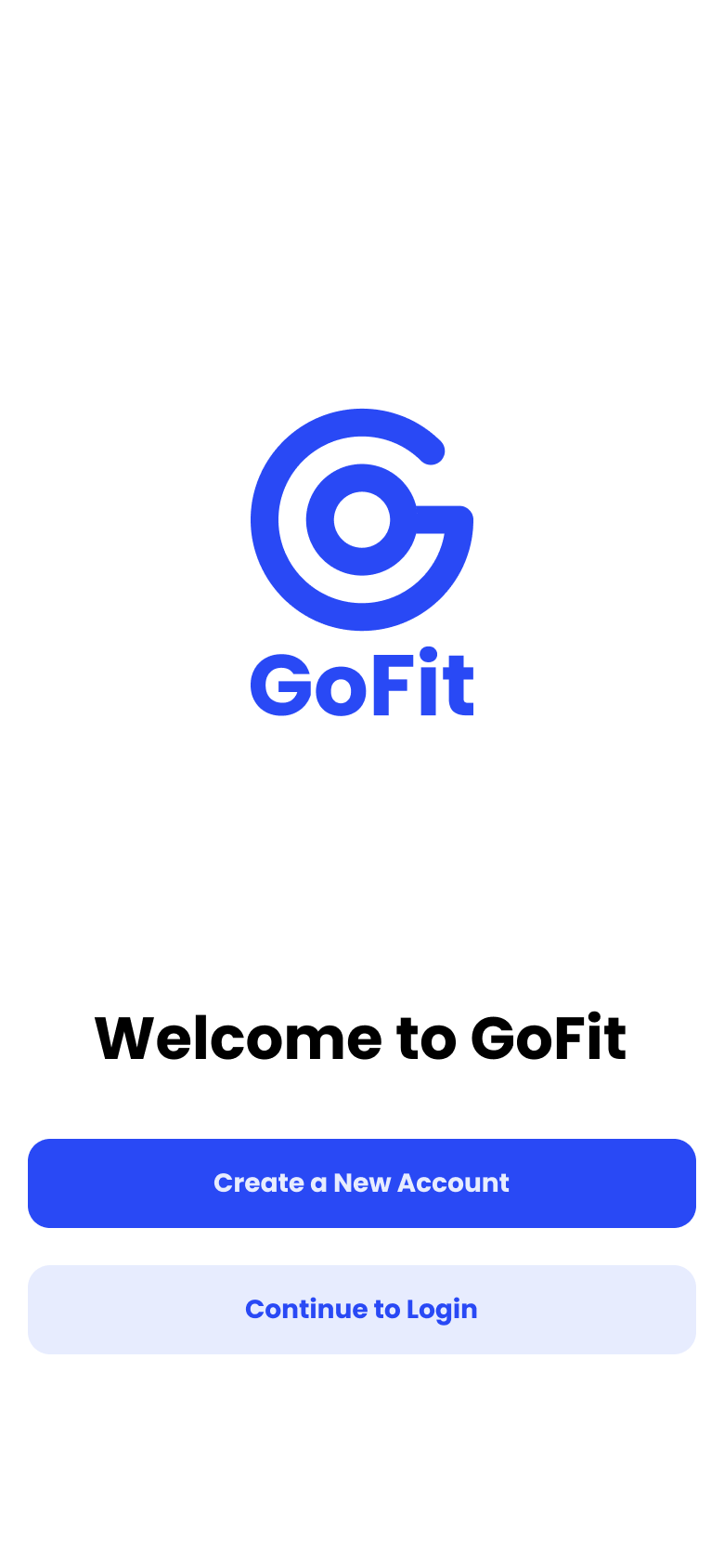
GoFit
Connecting fitness enthusiasts with nearby events and community, making it easier to stay active and accountable.
Visual Designer
The Brief.
Pick a UN Sustainable Development Goal. Explore real problems people face around it. Design a solution — from research all the way through to a high-fidelity prototype.
Our team chose SDG #3 — Good Health & Well-Being, and focused on physical fitness — an area where the gap between intention and action is well documented, and one we all had personal stakes in.
Research.
13
Interview participants
3
Competitors audited
6
Usability testers
What already exists?
We audited existing tools to understand the space and find where they fell short.
| App | Type | What it does well | What's missing |
|---|---|---|---|
| Partial CompetitorTeamSnap | Sports team management | Robust scheduling, private media sharing, instant team comms | Locked to existing teams — no discovery of new people or events |
| Indirect CompetitorSquaddy | Group fitness coordination | Community building, progress tracking, shared interests | Weak social layer — browsing local activity or meeting strangers is an afterthought |
| Analogous CompetitorCitizen | Local event/safety feed | Real-time local updates, community engagement | 1.5mi radius cap, no fitness context, no coordination features |
The tools that existed either served existing groups or enabled passive discovery — nothing bridged both with active coordination.
What do people actually want?
We ran semi-structured interviews with 13 people across a range of fitness activities — from gym regulars to weekend hikers. Four themes surfaced consistently.
Most people said
Group activities keep them consistent
Working out with others is what actually builds a habit. Solo workouts are easy to skip.
Many people said
They plan fitness ahead of time
Spontaneous plans rarely work. People want to schedule activities around the rest of their week.
Many people said
They want to meet people, work out together
Fitness is a vehicle for community. New connections were a primary motivator — health outcomes came second.
Most people said
Tracking progress keeps them motivated
Visibility into what they've done — stats, streaks, history — reinforces the behaviour loop.
Defining the Problem.
Who are we designing for?
Two distinct user types emerged from the research. Both want to be active with others — they just lack the tools to make it happen reliably.
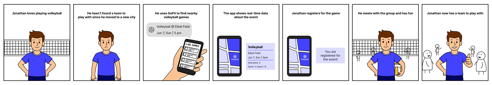
Jonathan, 23
"I want to play volleyball but I haven't found people to play with ever since I moved."
Goals
- Stay physically active and maintain fitness
- Join team sports and group activities
- Make friends with similar interests
Frustrations
- Shows up to fields to find no one there
- No reliable way to find people with common interests
- Individual sports feel isolating
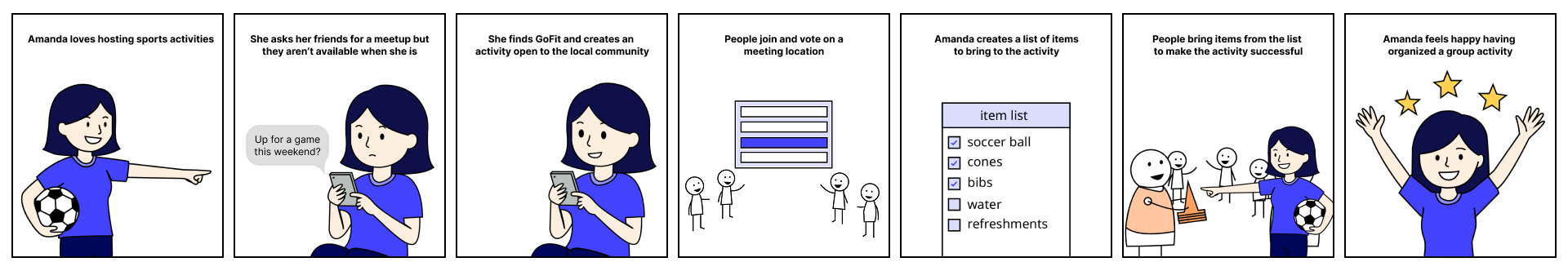
Amanda, 24
"I love planning group activities — I just wish there was one place to handle all of it."
Goals
- Organise group fitness activities for her friends
- Coordinate logistics — gear lists, meeting points, timing
- Make sure everyone shows up prepared and on time
Frustrations
- Coordinating over group chats is chaotic and easy to miss
- No way to share a gear list or checklist alongside the event
- People show up unprepared because details got buried
How might we...
Design a support system for fitness enthusiasts that provides resources, keeps them informed and motivated, and helps them discover nearby fitness events?
Design.
Mapping real scenarios
Before sketching screens, we built storyboards around Jonathan and Amanda's journeys — to validate that our features solved real moments, not hypothetical ones.
Jonathan's story
He finds a local volleyball event, RSVPs, shows up, and meets people with shared interests. The app handles discovery and coordination.
Amanda's story
She creates a group soccer game, adds a checklist of what to bring, people show up prepared, they play together, and she feels the satisfaction of a plan that actually worked.
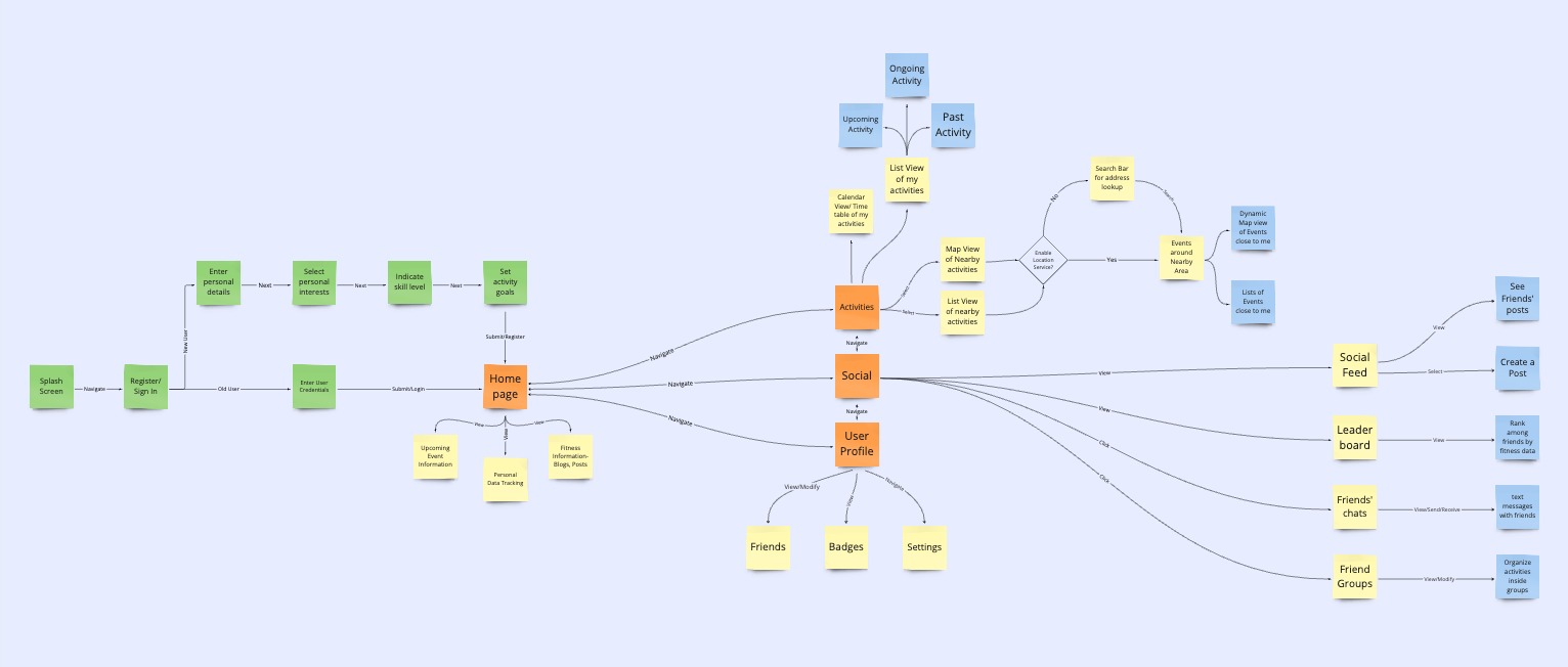
Locking in the feature set
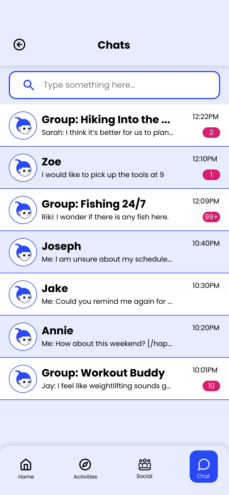
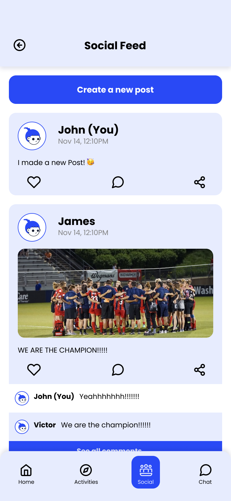
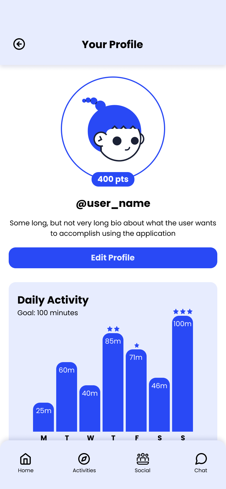
We built a user flow to map the exact sequence of steps users take — which locked in four core areas: Activity Discovery, Social Feed, Friend Groups, and Personal Tracking. Anything outside these four didn't make the cut.
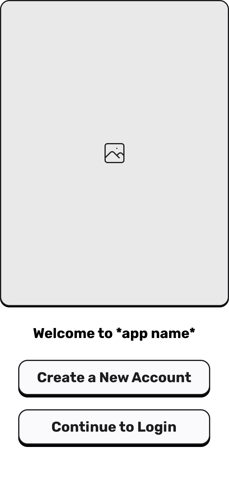
Testing structure before polish
We built lo-fi wireframes first — deliberately rough, so testers focused on whether flows made sense rather than how things looked. This let us catch structural problems early.
Testing & Iteration.
We ran moderated usability tests with 6 participants on the wireframes. Four issues came up repeatedly enough to act on.
Issue
Unclear grouping of UI elements
What changed
Regrouped related actions into cards with clearer visual hierarchy
Issue
Key actions were hidden or hard to find
What changed
Primary CTAs moved to a persistent bottom bar
Issue
Navigation felt complex and nested
What changed
Simplified from 5 tabs to 4; redundant nested menus removed
Issue
Distracting and redundant UI elements
What changed
Decorative elements stripped; spacing tightened throughout
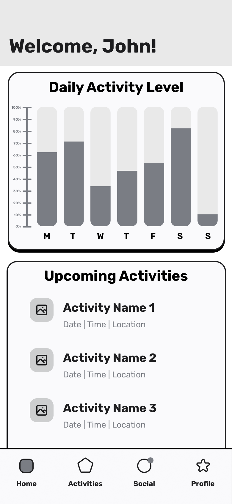
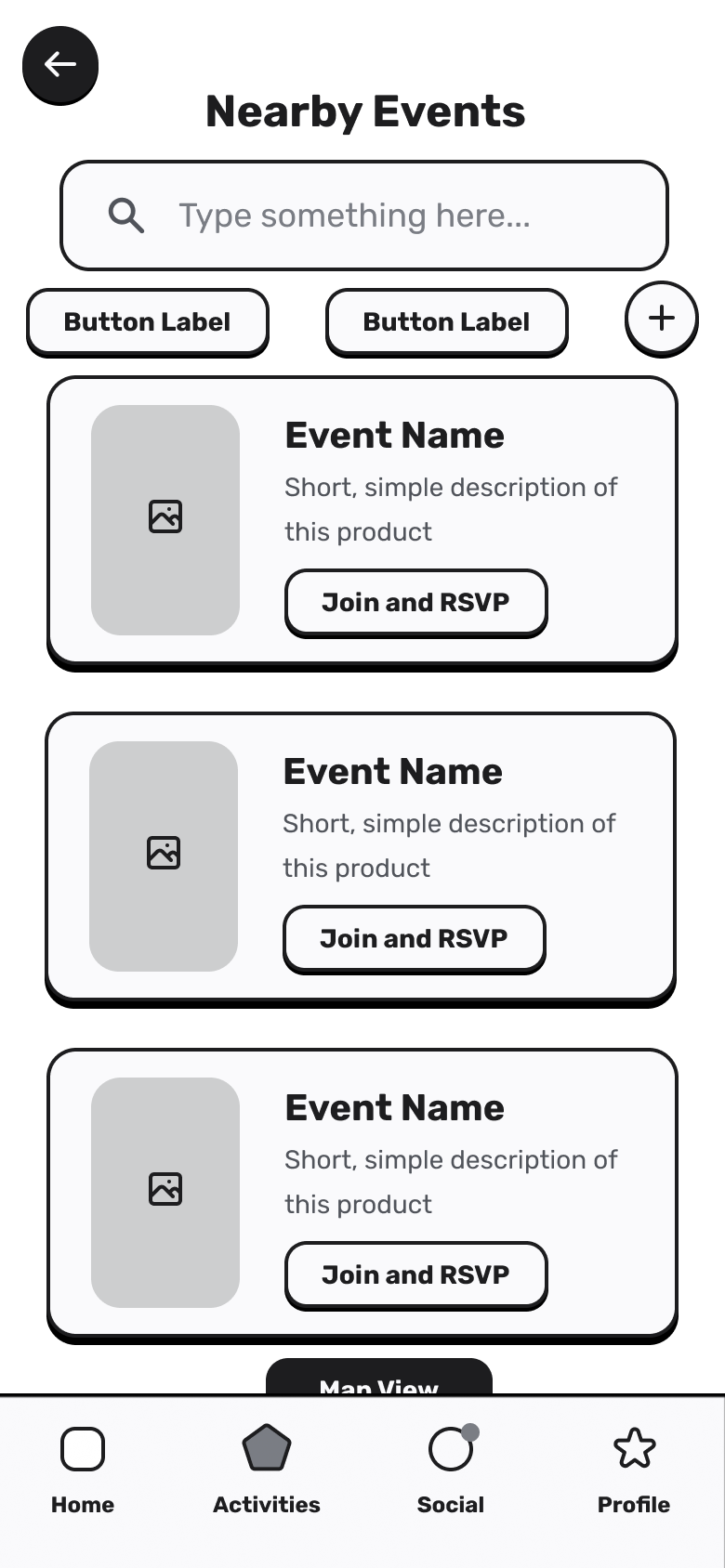
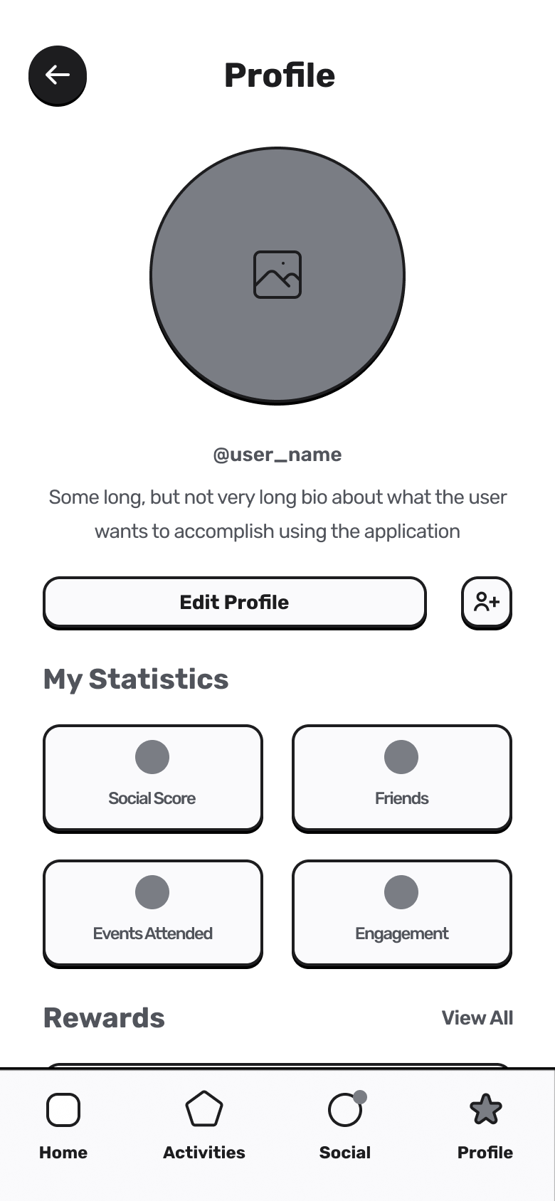
Final Design.
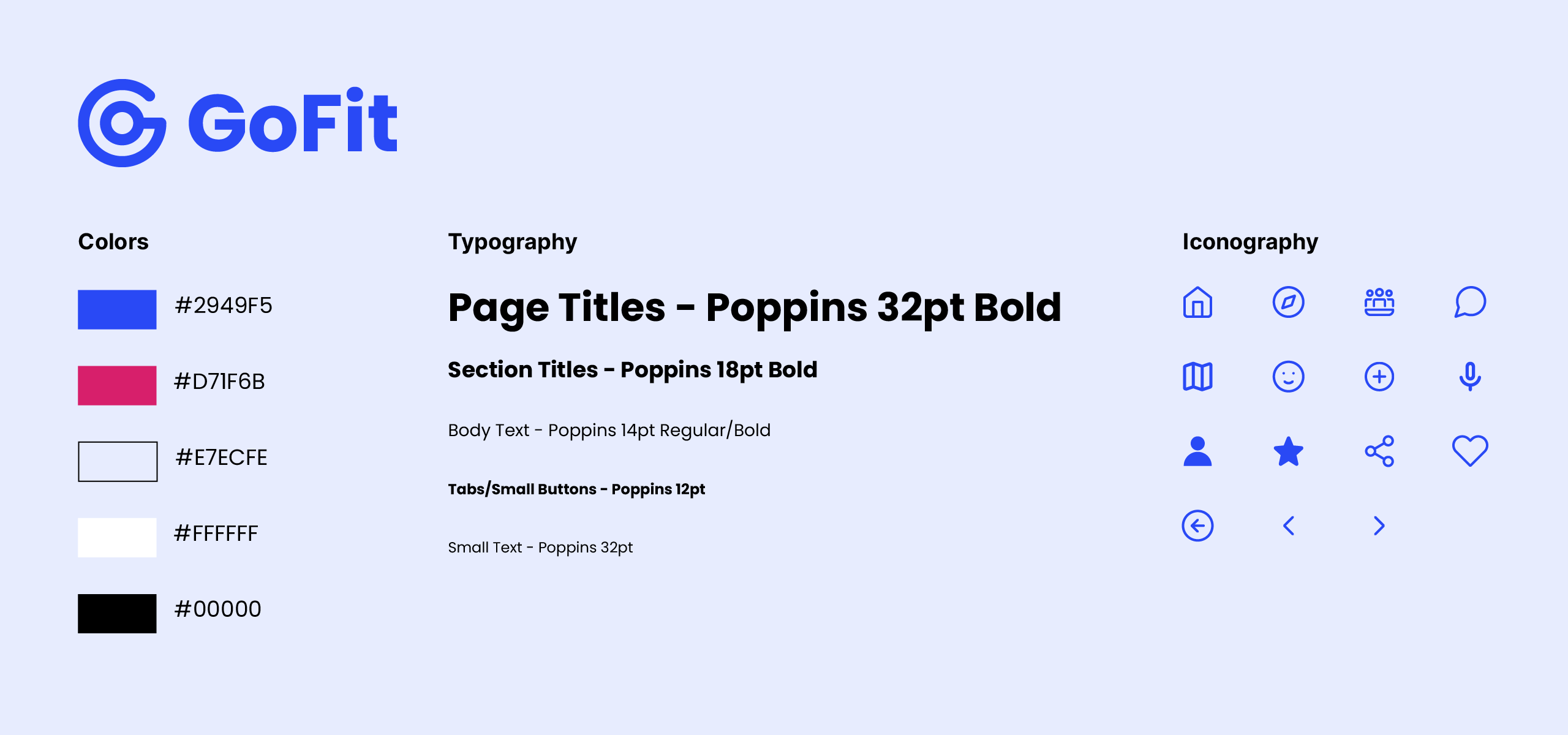
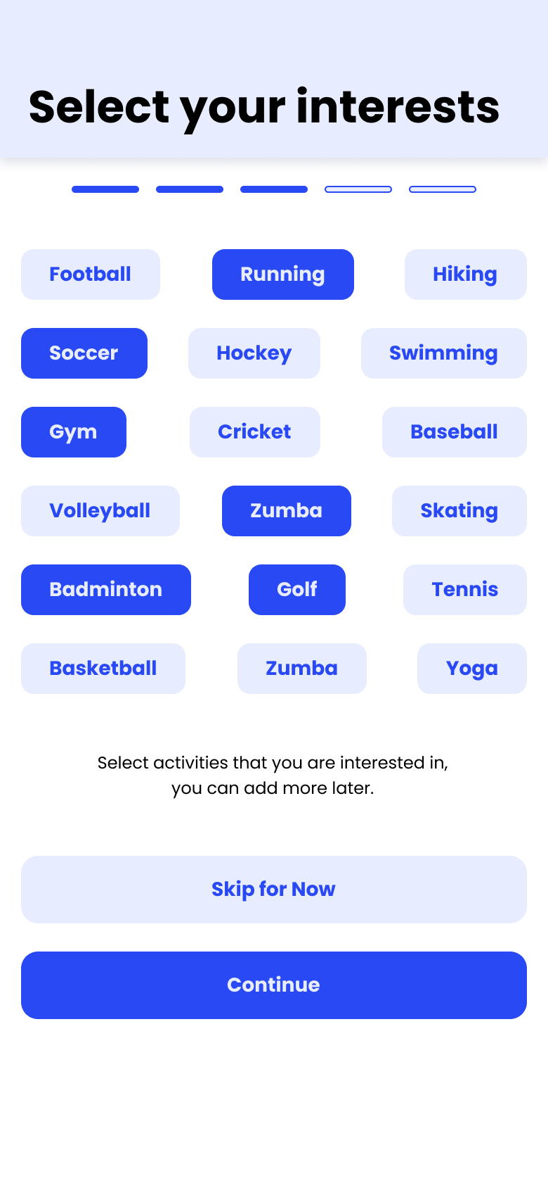
Visual language
The visual system needed to feel energetic and approachable — an active primary blue with a warm accent, Poppins for readability across all screen sizes, and a tight icon set mapped to the four core feature areas.
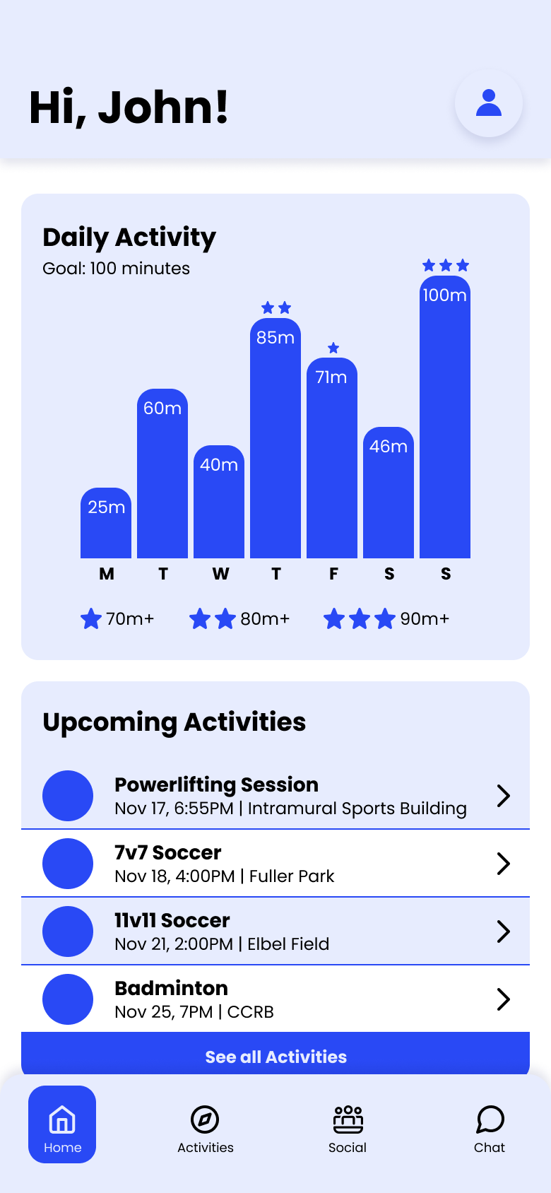
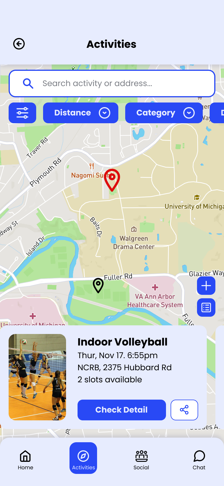
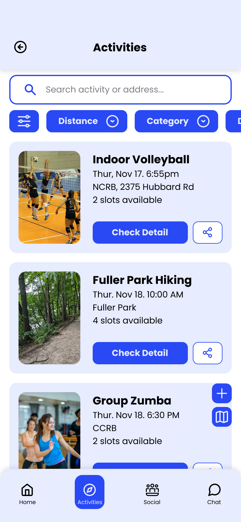
Screens
With the usability issues resolved, we built high-fidelity screens in Figma covering onboarding, event discovery, group coordination, and personal stats.
Prototype
Click through the full interactive prototype below.
Reflection.
Assumptions get expensive fast
We assumed tracking was the primary need — interviews showed connection was. That shift reshaped the entire feature priority.
Lo-fi is faster than it feels
Rough wireframes caught four structural issues before any visual design was done. Testing early saved significant rework time.
Fewer personas, sharper focus
Four personas diluted decisions. Two with clearly opposing needs made every design trade-off easier to reason about.