Aspire Design System
A design system built to address UI inconsistencies, improve workflow efficiency, and ensure accessibility.
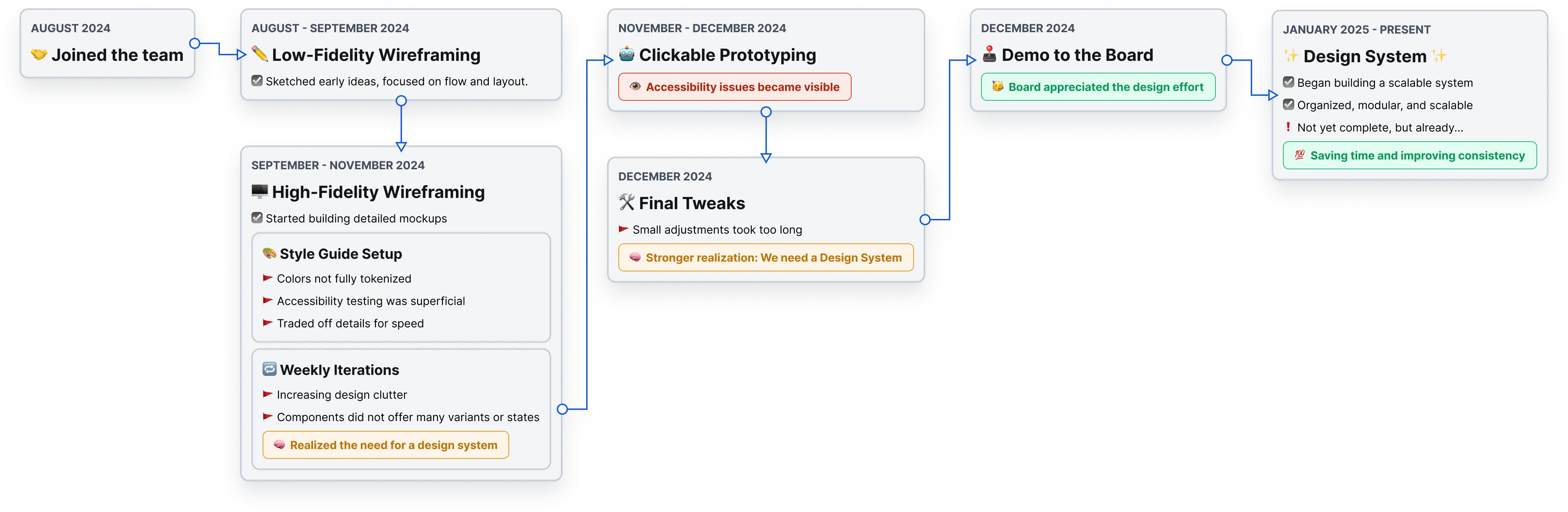
Kickoff & Chaos.
My journey at the Center for Societal Aspiration began when I joined as a UX/UI Designer, tasked with designing a platform that connects people with the right resources through a personalized approach. In our startup environment, we took an scrappy, outcome-based approach—aimed at saving time ✅ and speeding up development ⬆️.
At first, I set up typography styles and created a color palette with extensions—just enough to make something usable, even if the Figma file wasn't perfectly organized. This method worked well from a product standpoint, but as the designer, I soon found myself overwhelmed 🥵 by the constant need to navigate between pages, update components, and keep track of countless details.
Committed to delivering a prototype, I decided to wait until the business requirements were sorted out before tackling these deeper design issues. Then, drawing from my experience in developing Brand Guides and Brand Identities, I realized I could solve these challenges by creating a ✨Design System✨.
My Journey.
Issues with the design.
Disorganized File Structure
Inconsistent Designs
Accessibility Concerns
Incomplete Tokenization
Inconsistent Iconography
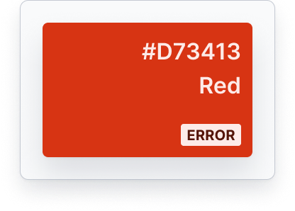
Low Contrast UI Elements
Impact on my workflow.
Repetitive Work
Slow to Make Changes
Too Much in my Head
It was clear that I needed to...
Create a Design System in Figma to — reduce inconsistencies ⬇️, improve accessibility 👌🏻, and streamline the workflow 🚀.
The Plan.
Create a Structure
Organize the Foundations
Build Core Components
File Structure.
Taking inspiration from the concepts of Object Oriented Programming, specifically Abstraction, I created two distinct files – one for the Foundational pieces, and another for Components – to isolate them from wireframes of the designs.
Foundations.
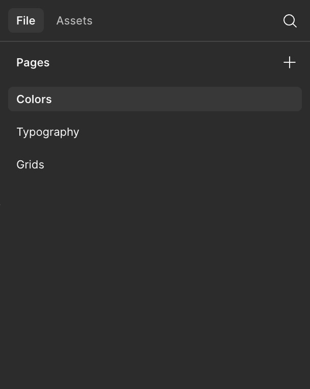
Components.
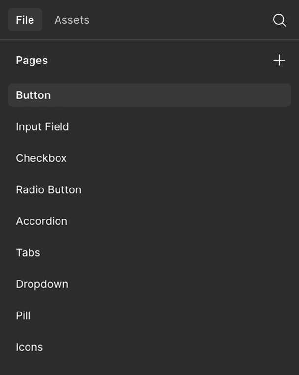
Design Foundations.
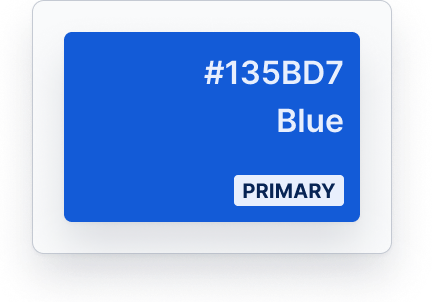
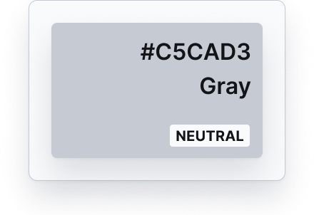
Colors.


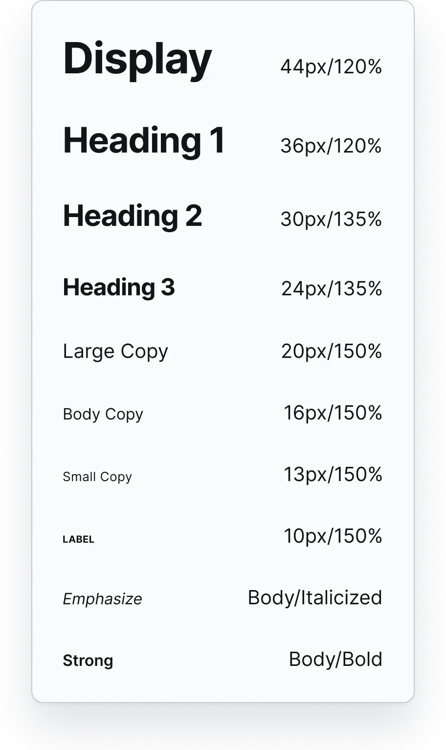
Typography / Desktop.
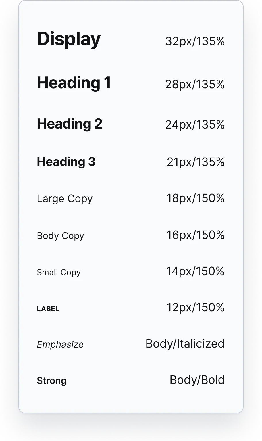
Typography / Mobile.
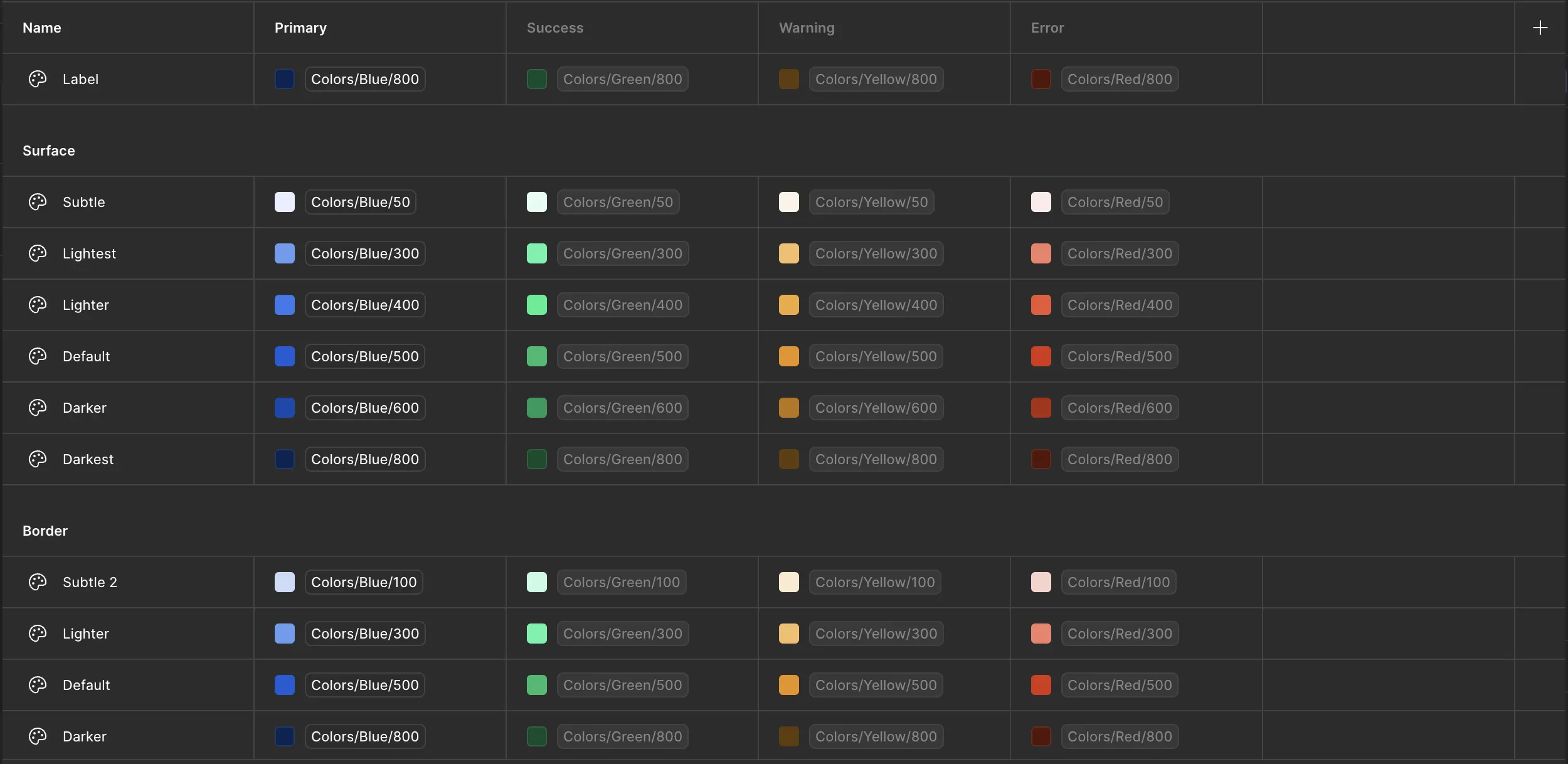
Color Tokens.
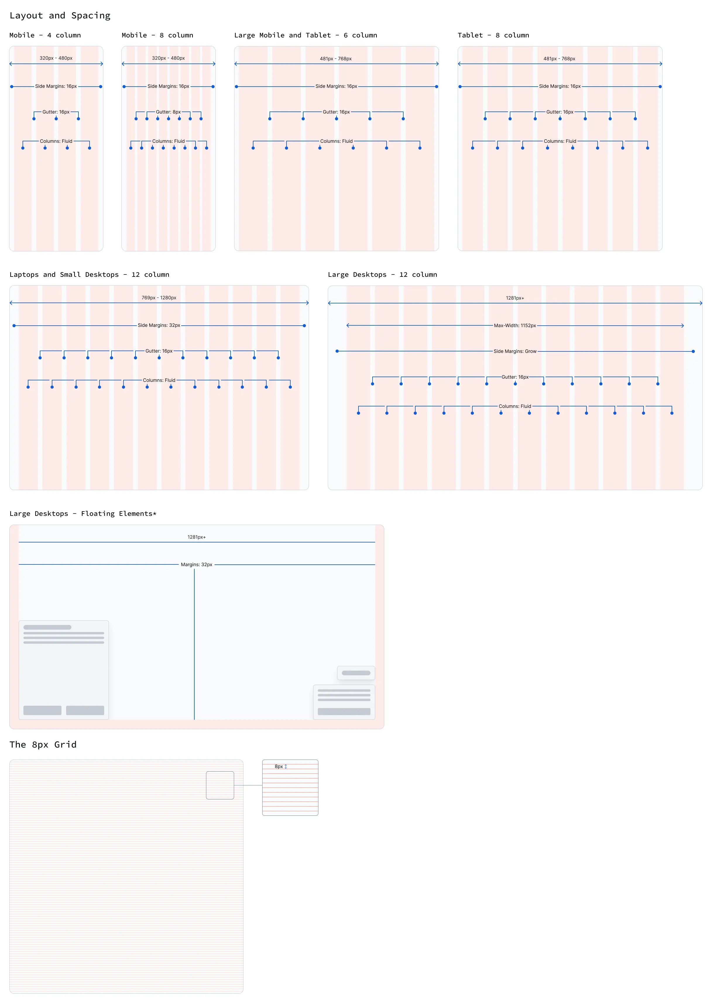
Layouts and Spacing.
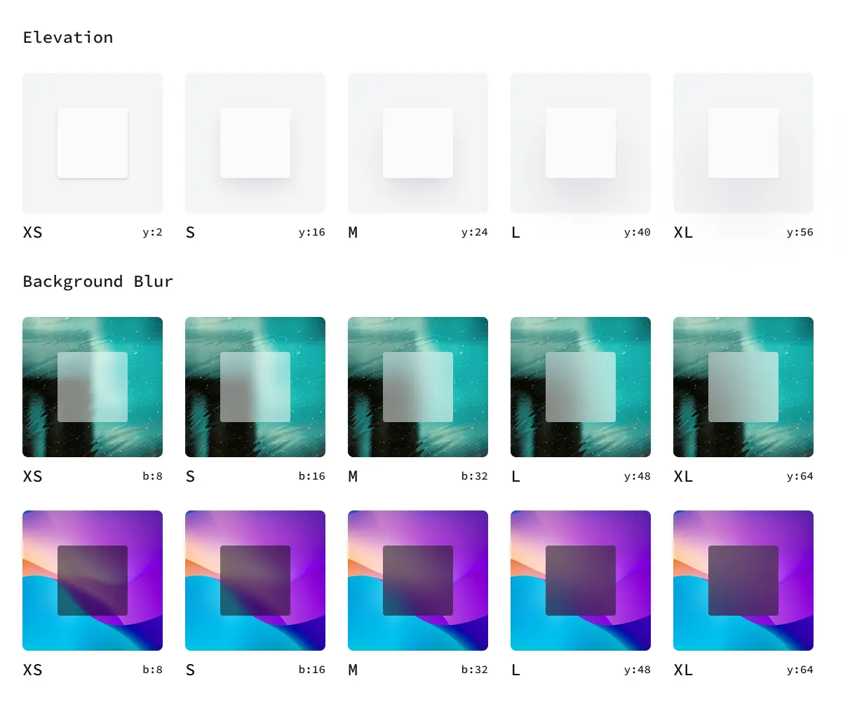
Styles.
Key Components.
Icons.
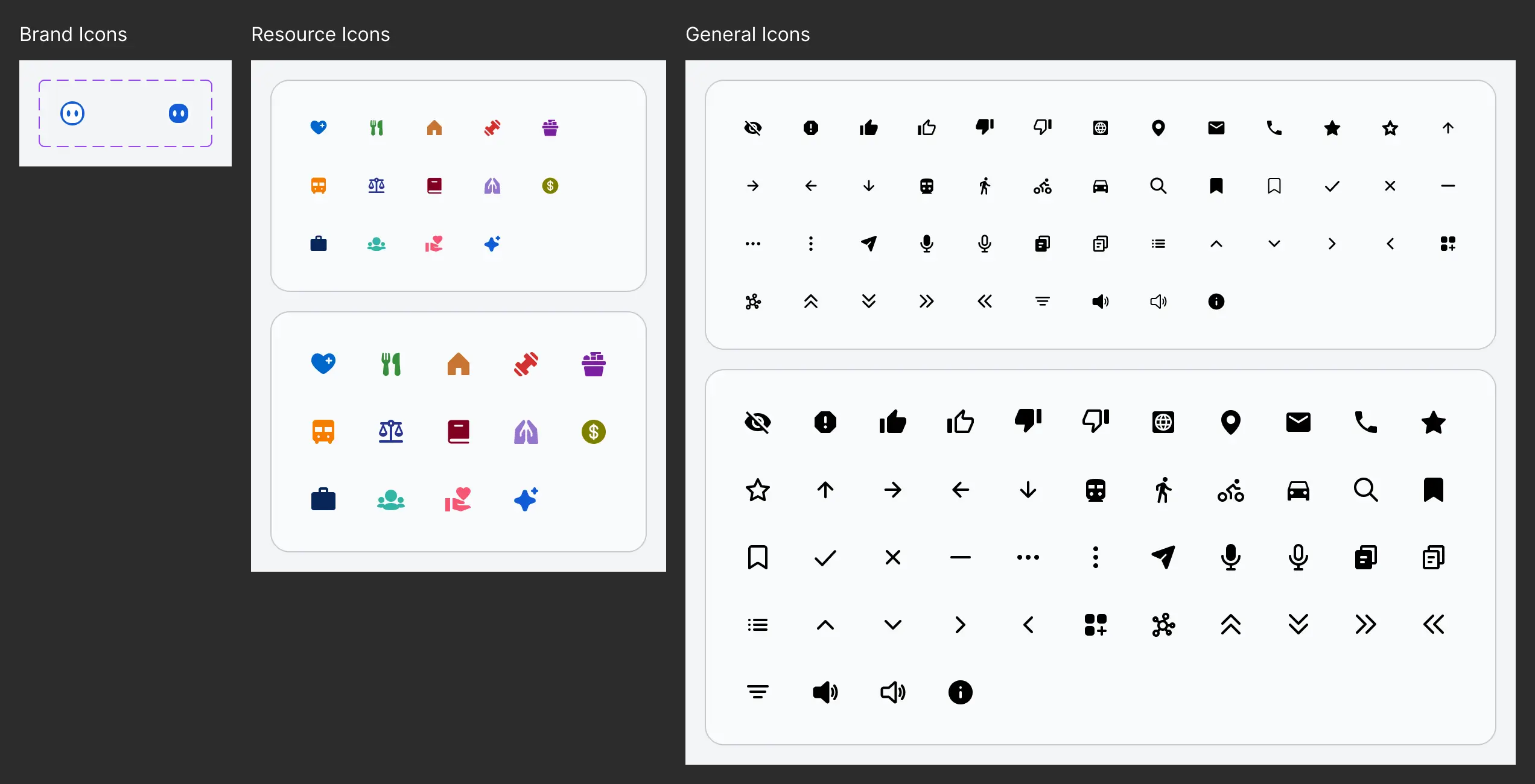
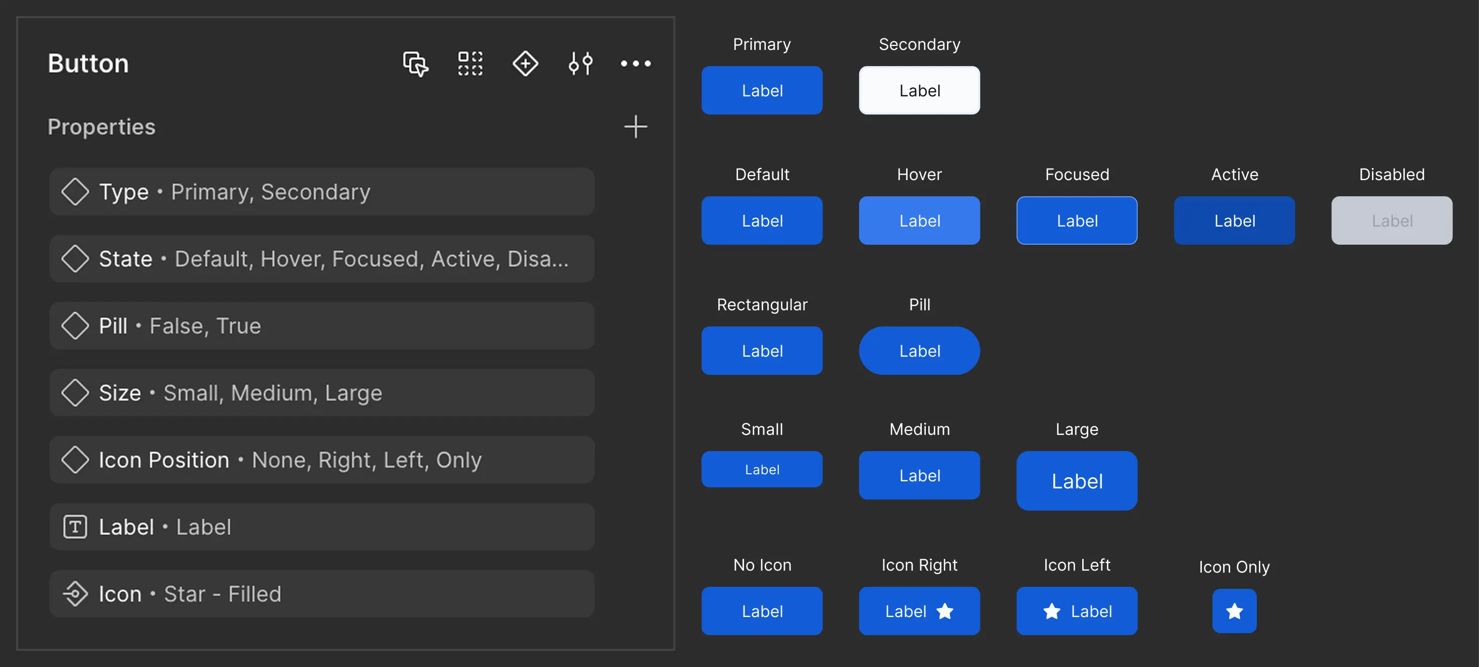
Buttons.
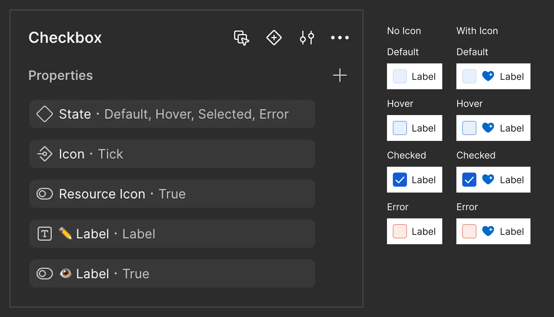
Checkbox.
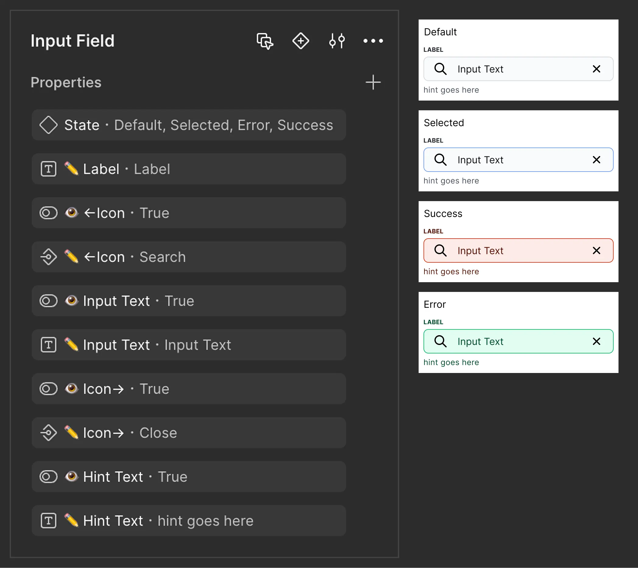
Input Field.
Outcomes.
A scalable, organized Design System now supports future development.
Reduced repetitive design tasks and improved consistency.
Easier onboarding for new designers and developers.
What I Learned.
Small issues compound
Inconsistencies, inaccessible styles, or missing documentation may seem minor — but they multiply fast and hurt the user experience and developer handoff.
Systems prevent chaos
Without a structured design system, even small changes create ripple effects and slow everything down.
Design systems are more than components
It's not just reusable UI — it's a shared language for design, dev, and product to work faster, smarter, and together.